The Fundamentals of Color in Interior Painting
Imperial Painting
Learn more about the basics of color theory, how it applies to home interior painting projects, and why you need to work with a painting professional.
Learn more about the basics of color theory, how it applies to home interior painting projects, and why you need to work with a painting professional.
Color isn’t just an aesthetic concept—it’s a tool that can define a space, set a mood, and create harmony and balance in the home.
Before you dip your brush into the paint, take the time to understand the fundamentals of color theory. Whether it’s warm, earthy tones or calming, cool blues hues, each color you choose has the potential to transform your space in meaningful ways.
In this article, we’ll cover some color theory concepts you should know, from balance and contrast to perception and mood.
Balance refers to harmonizing colors to complement the space rather than overwhelm it. This doesn’t mean all colors need to be identical or monochromatic. You can also create balance with a pleasing contrast. For example, pairing a bold color with neutral tones can create a striking yet balanced look in a home.
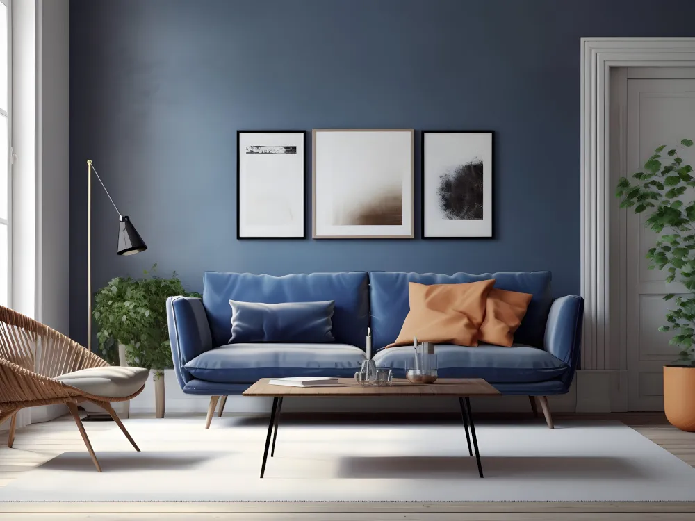
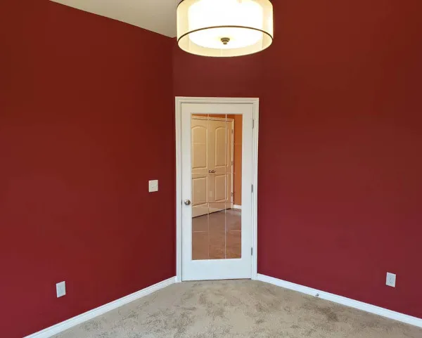
Another factor to consider in balance is the “weight” of colors. Some colors are “heavier” or more dominant than others. Dark or very bright colors can dominate a room, so they should be balanced with lighter, softer shades. So, if you use dark blue as a feature color, you might balance it with light gray or off-white in other areas of the room.
Regardless of what colors you use, it’s important to understand how they will interact with each other, the furniture, and the space itself. The goal should always be to create a harmonious environment where each color complements and enhances the other.
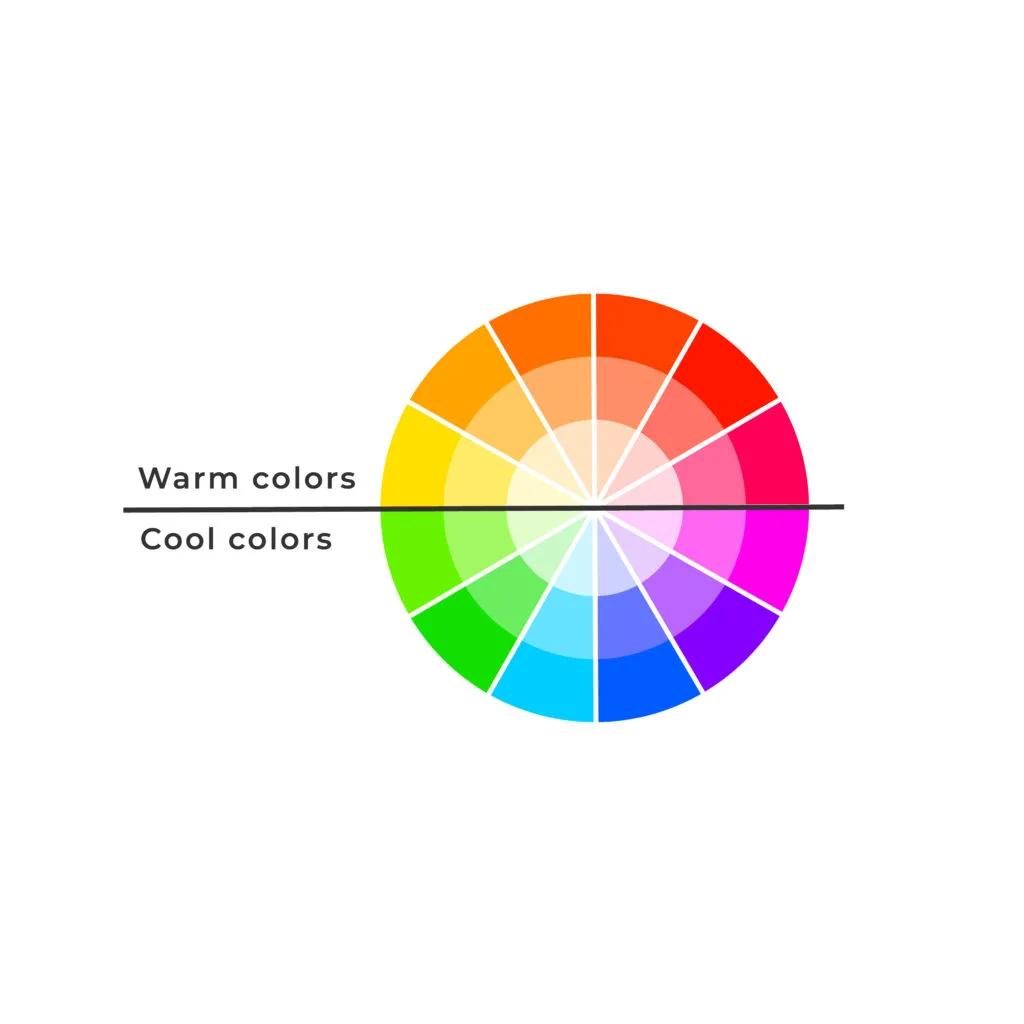
Certain colors, like reds, oranges, and yellows, are considered warm and are associated with energy, brightness, and action. In contrast, cool colors, like greens, purples, and blues, evoke calmness, serenity, and spaciousness.
Going back to the concept of balance, you can balance warm and cool colors to create a dynamic yet harmonious space. Warm colors can make large, sparse rooms feel more intimate and welcoming and are often used in living areas, kitchens, and dining rooms. Comparatively, cool colors create a tranquil, relaxing, and more open environment and are commonly used in bedrooms and bathrooms.
When applying color temperature in interior painting, consider the room’s purpose, size, and natural lighting. A north-facing room with less sunlight may benefit from warm colors to counteract the cool light, while a south-facing room with abundant light might be better suited to cool colors.
Colors also influence how we perceive space in terms of size, shape, and atmosphere. Similar to cool and warm colors, light colors can expand spaces and make them feel more open, while dark colors minimize space and make them cozier. This concept is particularly useful for either expanding a cramped space or making a large, empty room feel more intimate.
Perception of color is also influenced by light. The same color can look different under natural versus artificial light and even change throughout the day as the light changes.
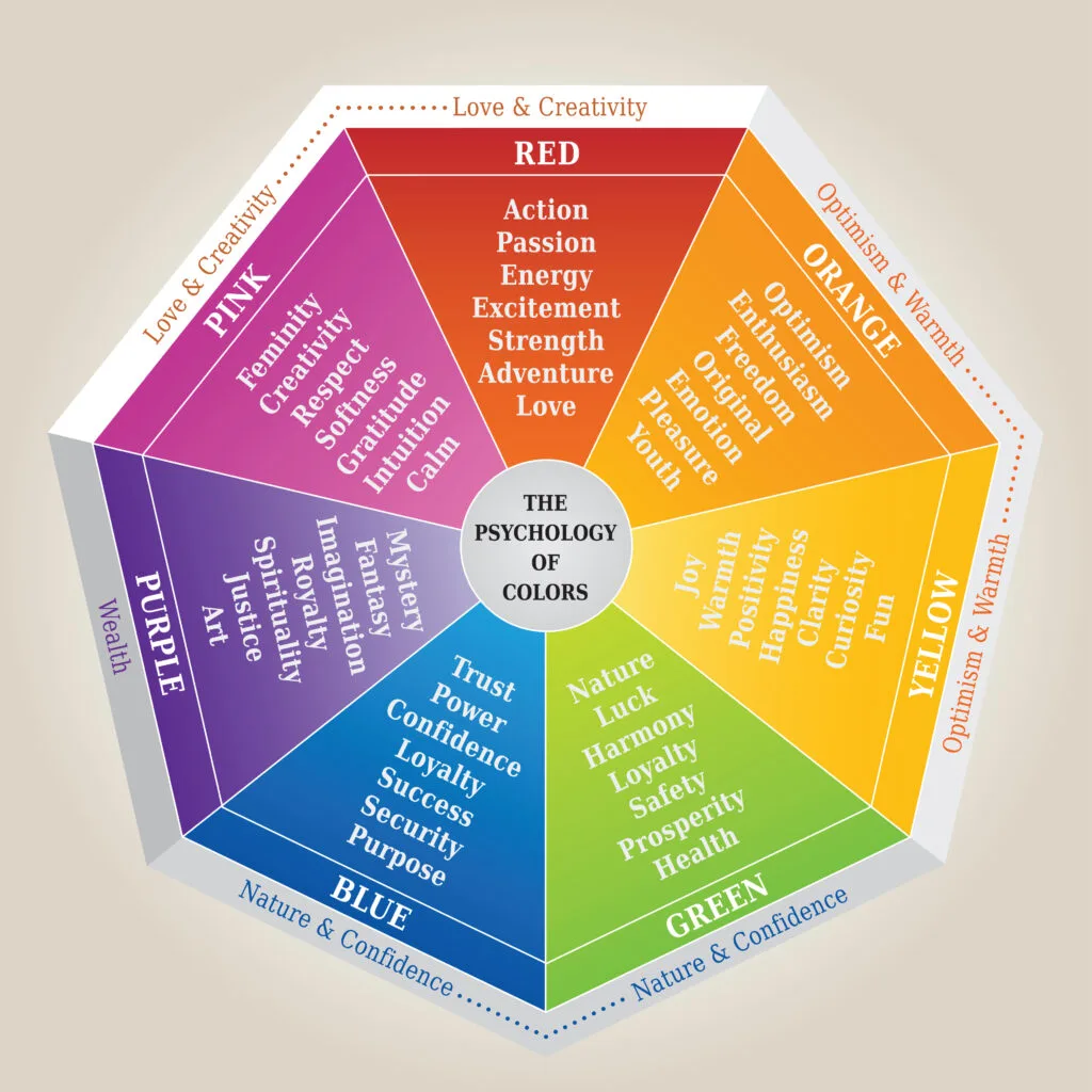
In nature, red is often associated with danger and aggression and is often a warning sign to other wildlife. While red doesn’t quite have the same meaning to humans, it doesn’t change the fact that color also influences our mood and how we perceive our environment. There is a reason why entertainment venues choose bold, vibrant colors and doctor’s offices choose calming, cool, or neutral colors.
Warm colors can feel either comfortable or exciting, depending on how they’re used. For example, red can stimulate appetite and conversation, making it a popular choice for dining areas.
Comparatively, cool colors are known to feel relaxing. Green, which is often found in nature, can be used to create a serene and refreshing atmosphere in almost any room.
Lastly, neutral colors, like white, beige, gray, and black, can create a sense of balance or stability and are versatile to work with as they make an excellent backdrop for other prominent design elements.
Let’s go back to the example at the beginning of this section—an entertainment venue might choose warm colors to create an intimate environment for attendees or to get them excited about an event. Doctor’s offices may use cool colors to create a more relaxing environment and reduce any stress or anxiety patients may be feeling, or neutral colors to help their patients feel more balanced and stable.
Contrast may seem like the opposite of balance, but these two concepts go hand in hand. Contrast can be achieved through differences in color, lightness, saturation, or a combination, and when done right, it can create a sense of balance in a room.
Color contrast is the most obvious example of this concept, where two distinctly different colors are used together. For example, a dark blue wall paired with a white trim can create a strong visual contrast that makes architectural details pop.
Using light and dark shades of the same or different colors can also add depth and interest to a space. A lighter wall color with darker accents can create a sophisticated and layered look. Similarly, a dark wall color with light furnishings can appear bold and dramatic.
Outside of color, you can contrast textures and patterns. A smooth, matte color wall paired with a textured rug or glossy furniture can add visual interest to a room.
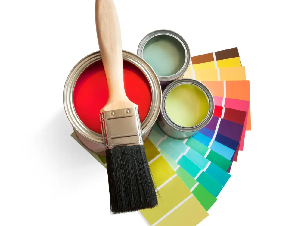
Color matching, while not a core principle in color theory, is a fundamental aspect to consider in interior painting, especially when it comes to refreshing an existing space or restoring dull color.
If you’re not overhauling the entire color scheme of a room, you’ll need to match your new paint to the existing colors to ensure consistency and cohesiveness.
Additionally, when adding new elements to a room, like furniture and curtains, color matching helps create a harmonious look. Colors that clash can disrupt the visual flow and feel of a space.
It’s important to note that color matching can be tricky. Factors like lighting, paint finish, and the age of the existing paint can affect how a color appears. Paint tends to change color over time due to exposure to sunlight and other environmental factors. Due to these challenges, it’s wise to seek professional assistance.
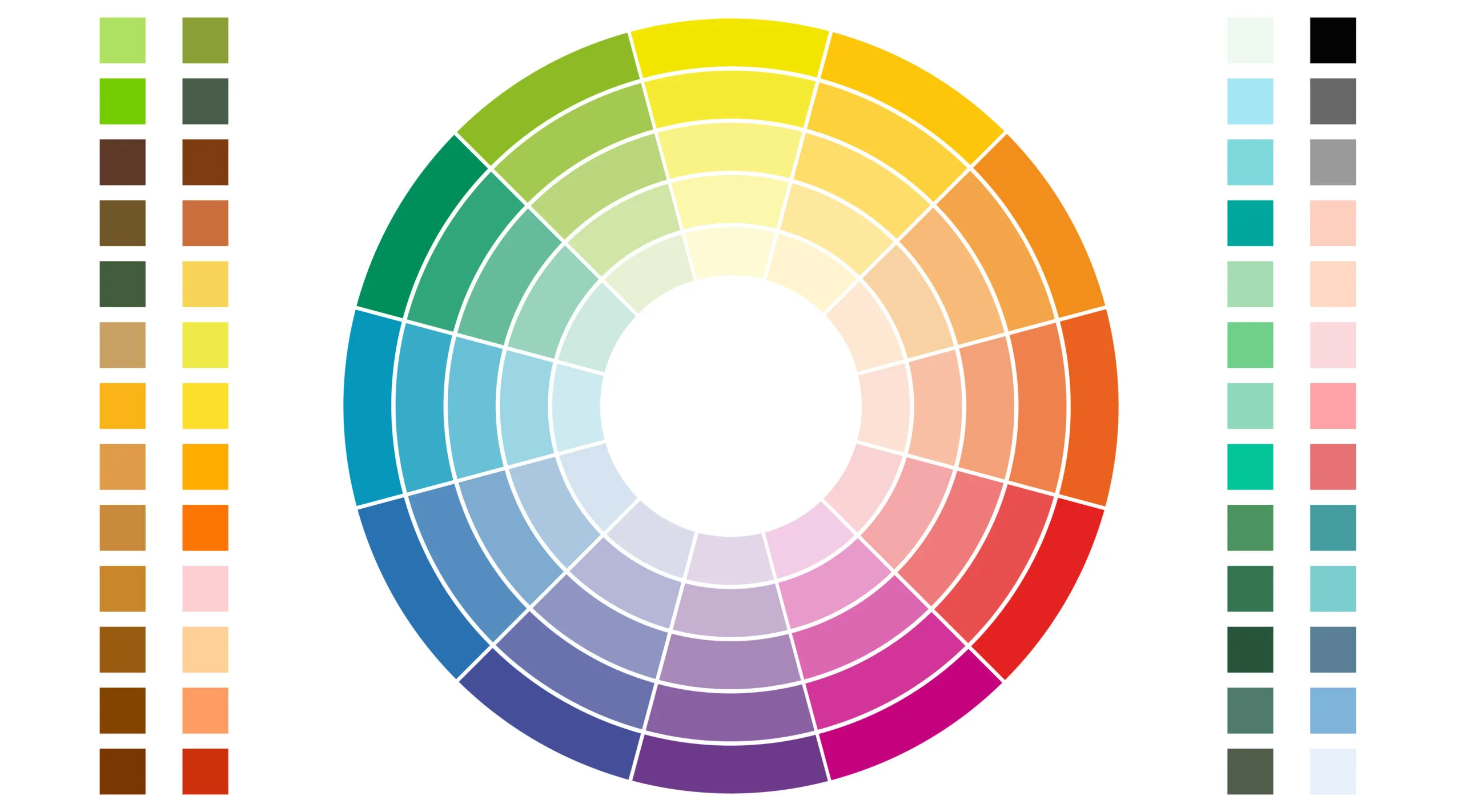
If you’re still deciding which colors to use in your space, consult the table below. This table outlines primary and secondary colors and their characteristics.
| Color | Temperature | Weight | Mood | Perception | Complementary Colors | Contrasting Colors |
|---|---|---|---|---|---|---|
| Red | Warm | Heavy | Passion & Energy | Minimizes Space, Adds Warmth | Green | Blue, Green |
| Orange | Warm | Medium-Heavy | Warmth & Joy | Minimizes Space, Adds Warmth | Blue | Blue, Purple |
| Yellow | Warm | Light | Happiness & Energy | Expands & Brightens Space | Purple, Blue | Green |
| Green | Cool | Medium | Calm & Relaxing | Expands Spaces & Creates Soothing Environment | Red | Red, Orange |
| Blue | Cool | Medium-Light | Serenity & Trust | Expands Spaces & Creates Calming Effect | Purple | Orange, Yellow |
| Purple | Cool | Medium-Heavy | Luxury & Creativity | Minimizes Space & Adds Depth | Blue | Yellow, Red |
Remember—how colors are perceived can vary based on lighting, surrounding colors, and personal preferences. The particular shade of color may also influence which colors are complementary or contrasting. It’s always a good idea to test colors in your space before committing to them and to work with a painting professional.
What do you want out of your space? Do you want it to be cozy and inviting? Serene and calming? Or vibrant and energizing?
No matter your vision, our team at Imperial Painting is here to help you bring it to life.
Imperial Painting is a fully licensed and insured painting company serving homeowners in Shelby Township, MI, and surrounding communities. We offer many services, including interior painting, color matching, and interior decorating assistance.
Whether you’re refreshing your space or diving into something new, you can count on us for professional advice and recommendations, quality workmanship, exceptional customer support, and transparent communication.
Please contact us today to get started with a free estimate and project consultation.


Macomb: (586) 412-9040
Oakland: (248) 275-5657